Shareaholic is the world’s leading all-in-one Content Amplification Platform. It is the preferred discovery, amplification and engagement platform for more than 300,000 websites, representing one of the largest and fastest growing networks of websites. Shareaholic’s products reach over 450 million people across every continent each month. Or put another way, if Shareaholic’s audience was a country, it’d be the 4th largest country in the world.
The Project
Shareaholic was one of my favourite projects to work on, not just because it was agile enough to test my designs almost immediately on real users, but also because I had a complete control on the entire platform in terms of UX. I was hired to redesign the core app from ground up while significantly improving the UX.
I also created a couple of more engaging apps which would increase the service offering of the company.
The Information Architecture
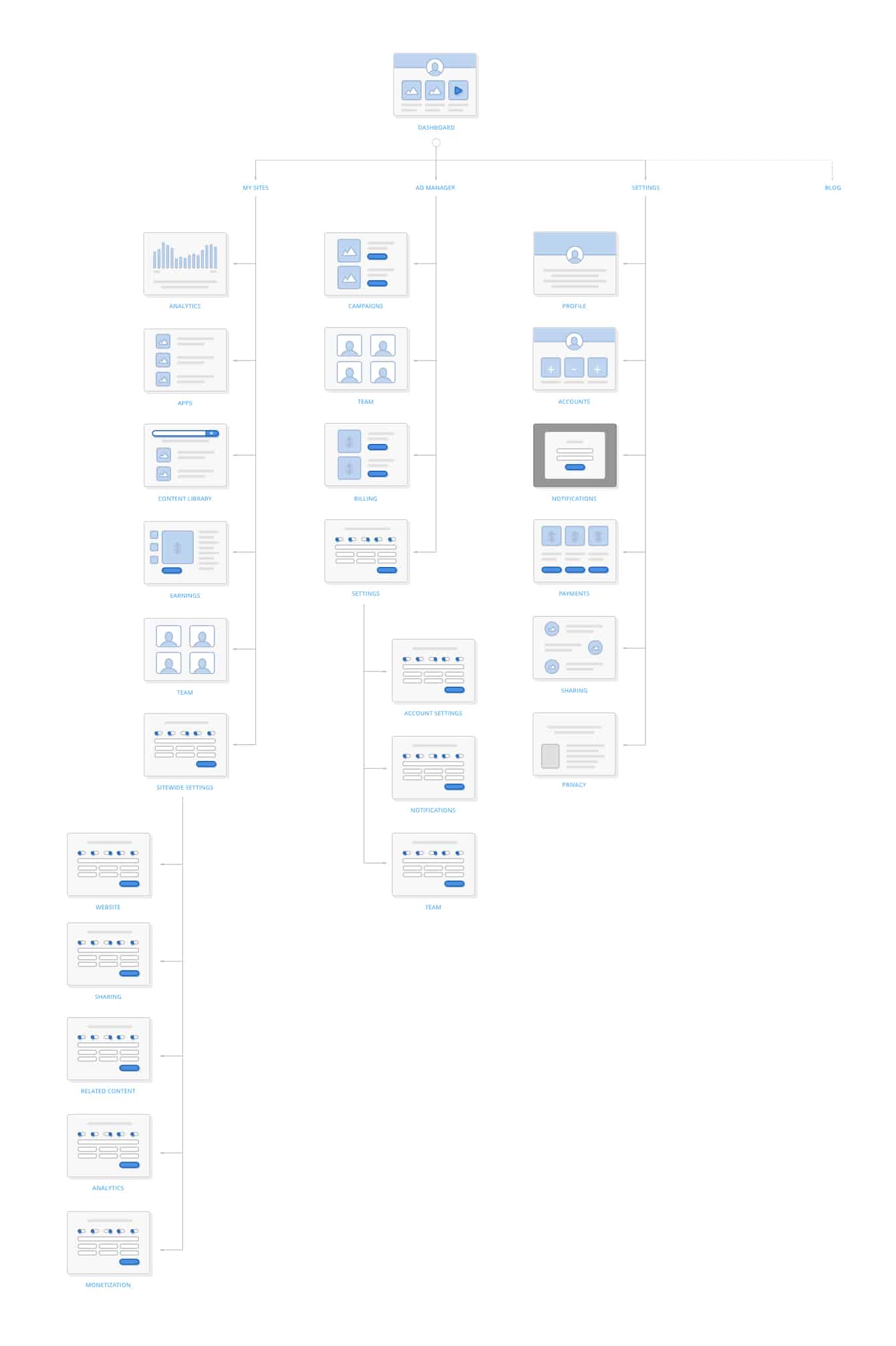
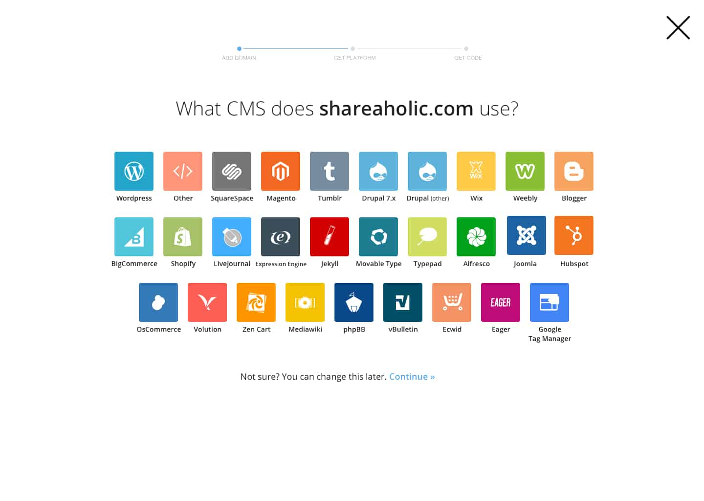
The major UX challenge in the project was to simplify the information architecture. Shareaholic is actively building new features and apps which go live almost instantly. And the new design had to accomodate all of them, float the newer apps while not burying the old ones. Apart from how the apps were presented to the user, the everything-at-once navigation was very cluttered, if not a mess.
I worked on making a clear hierarchy which made navigating through different sections, once you’re logged-in, easier and logical. The restructuring of the pages/sections was a big challenge in itself because of the number of interconnected parts within Shareaholic.

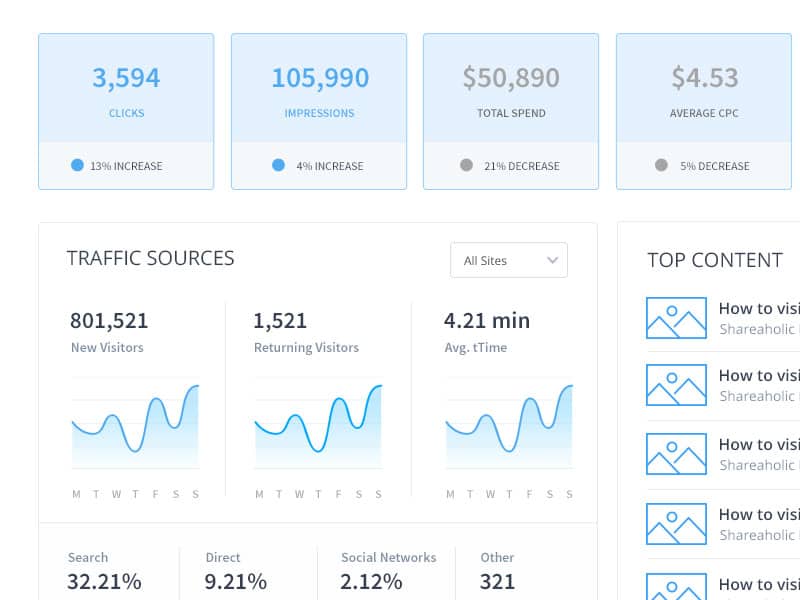
Visual Design
It was fun building the user interface for Shareaholic. Not only because every change would show up on thousands of websites, but also because it was a massive redesign. I have been working with Browserstack, which makes data-driven incremental design changes, for the last few months so it was a refreshing change to make big, bold, sitewide changes . I designed right from the color palette & the basic icons to full fledged dashboards, app interfaces and authenticated sections.
A sneak-peek of the upcoming visual style.
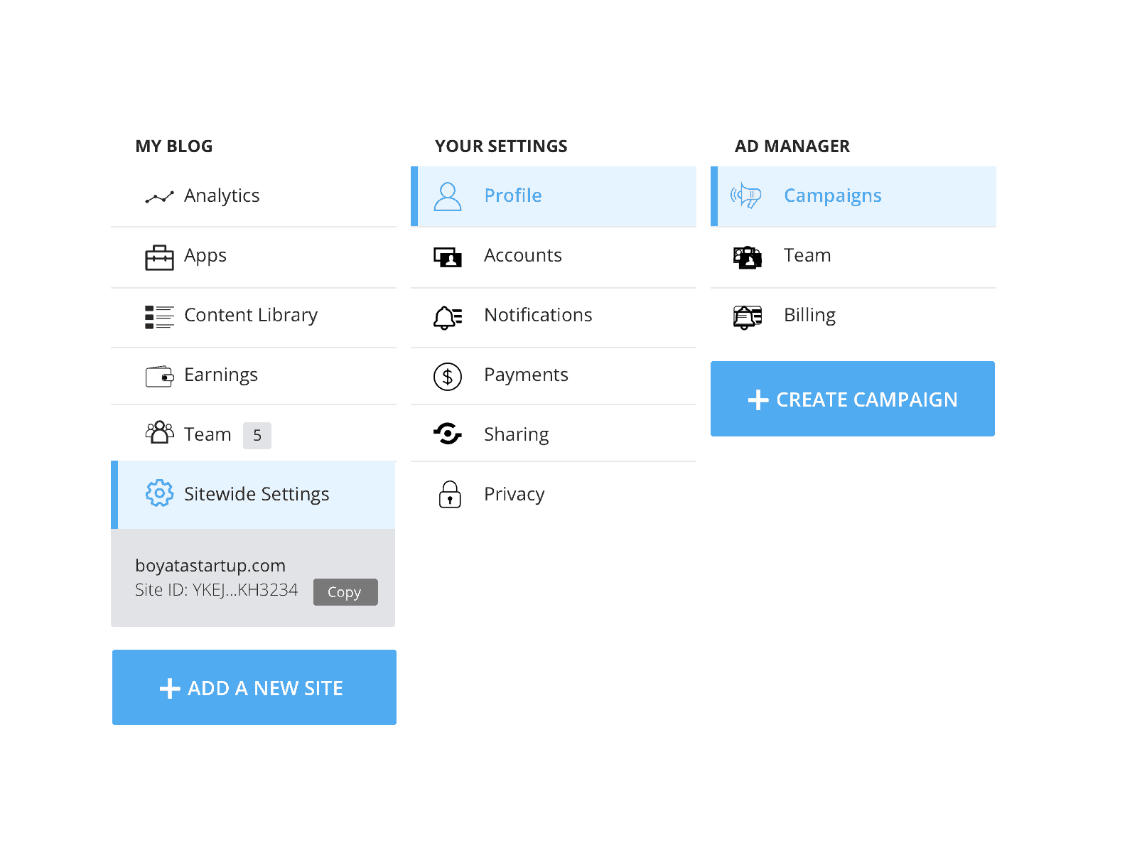
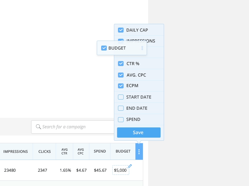
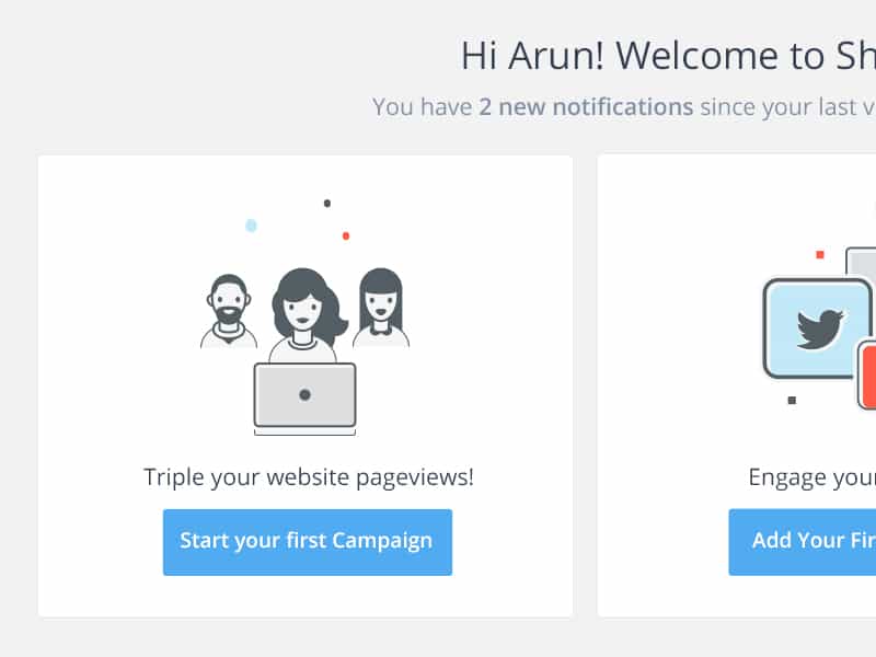
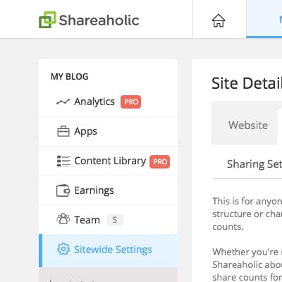
Site Navigation
Once the information architecture was in place, the first step towards a visual makeover was to restructure the menu. I decluttered the side panel by splitting it into three different sidebars which were specific to the section of the product being shown, instead of the previous all-in-one bar. This complimented the thoroughly planned yet minimal global menu on the top.
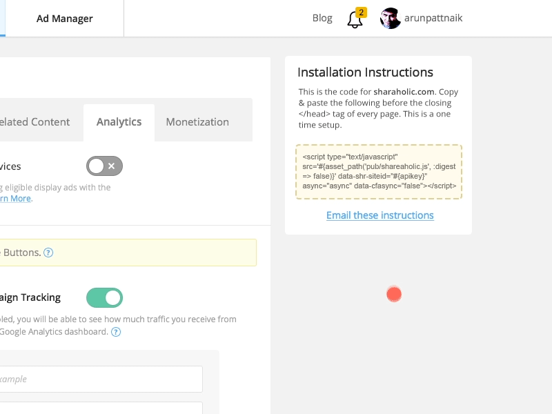
Iconography
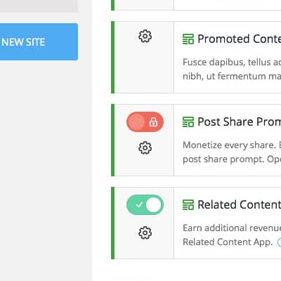
I have always been a fan of line-icons, instead of solid icons. So it was an easy choice to make. However, we went with a thick line icons instead of the popular 1px line icons because it was a better fit for the overall visual style. We decided to experiment with two-color icons for primary menu options to separate them from single-color icons throughout the app.
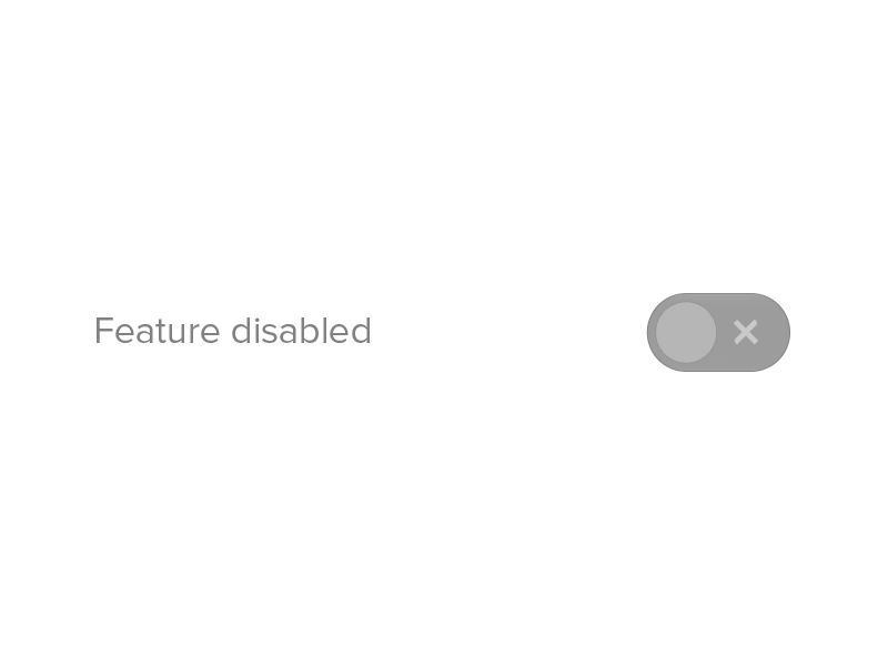
Interaction Design
Since I was working remotely from India and the dev team was based in Boston, it became crucial that I communicate my ideas with as much clarity as possible. The difference in timezone made calls or Webex difficult, and static design mockups with annotations and notes aren’t really efficient.
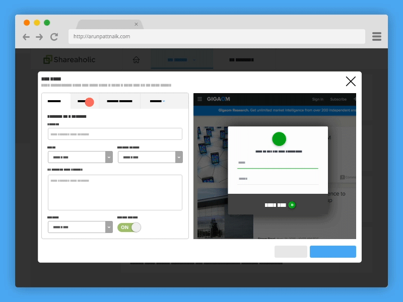
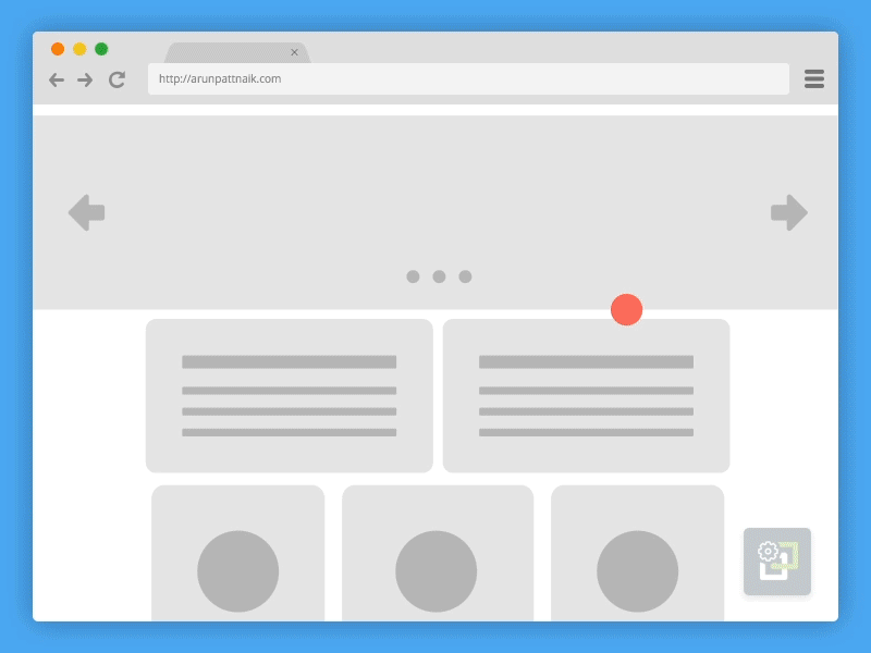
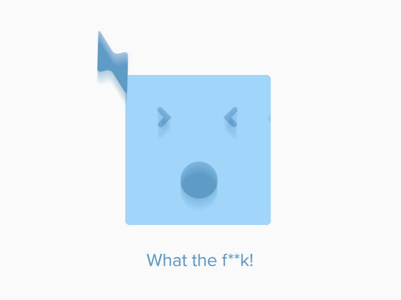
So I made a lot micro-interactions to explain how the designs are supposed to interact with the user’s actions. While larger screens were low-fidelity wireframe level (modals & page-transitions, for instance), the smaller interactions were based on the actual UI. This turned out very efficient. For every hour I spent on prototyping, we roughly saved at least six hours of assumptions-based development work.
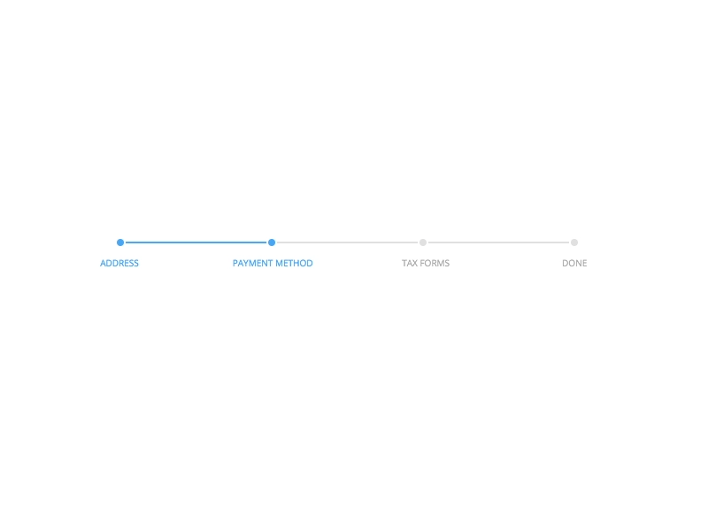
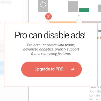
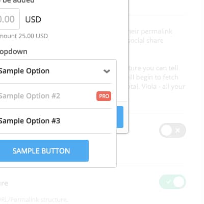
Pro Memberships
Since inception, Shareaholic’s primary source of revenues was ads. One major part of my engagement was to work on a new direct-monetisation model which would massively impact revenues and profitability. I worked on premium features which the members would pay for. This part is under NDA so I can not disclose more details.

Shareaholic builds widgets and apps which are installed in hundreds of thousands of blogs and websites worldwide. If you have a similar project and you’re looking for someone over a decade of experience in designing, we should talk.