“When you click on the red button it should quickly, but not abruptly, fade to #222 and move downwards while the 1px box above expands to display the full content. Also, while this is happening the header bar should turn transparent and slide out of the view”
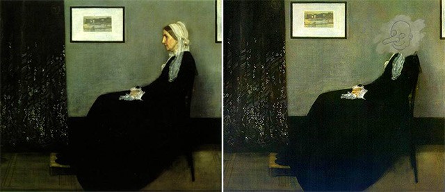
In the last 10 years as a designer, one of the most frustrating things has been the numerous misunderstandings I’ve had with front-end developers about the accuracy of interaction designs. We, the designers, design pixel perfect interfaces and their transition states and hand them over to the developers hoping for the perfect output. They have screen A, they have screen B, and now they just have to code the transition. What could possibly go wrong, right?
Well, here’s a fact – the programmers DO NOT visualise the transitions the way we designers do. Sometimes they can’t, and sometimes they just don’t have the bandwidth to do so. While we think (and hence imagine) visually, they have to think of writing clean, minimal code, using existing libraries & modules. So it’s more logical for them to spend less time thinking (or rather making assumptions) of what would be the best transition and more time coding what’s the fastest way to get it done. This is where the micro-interaction designs come into the picture.
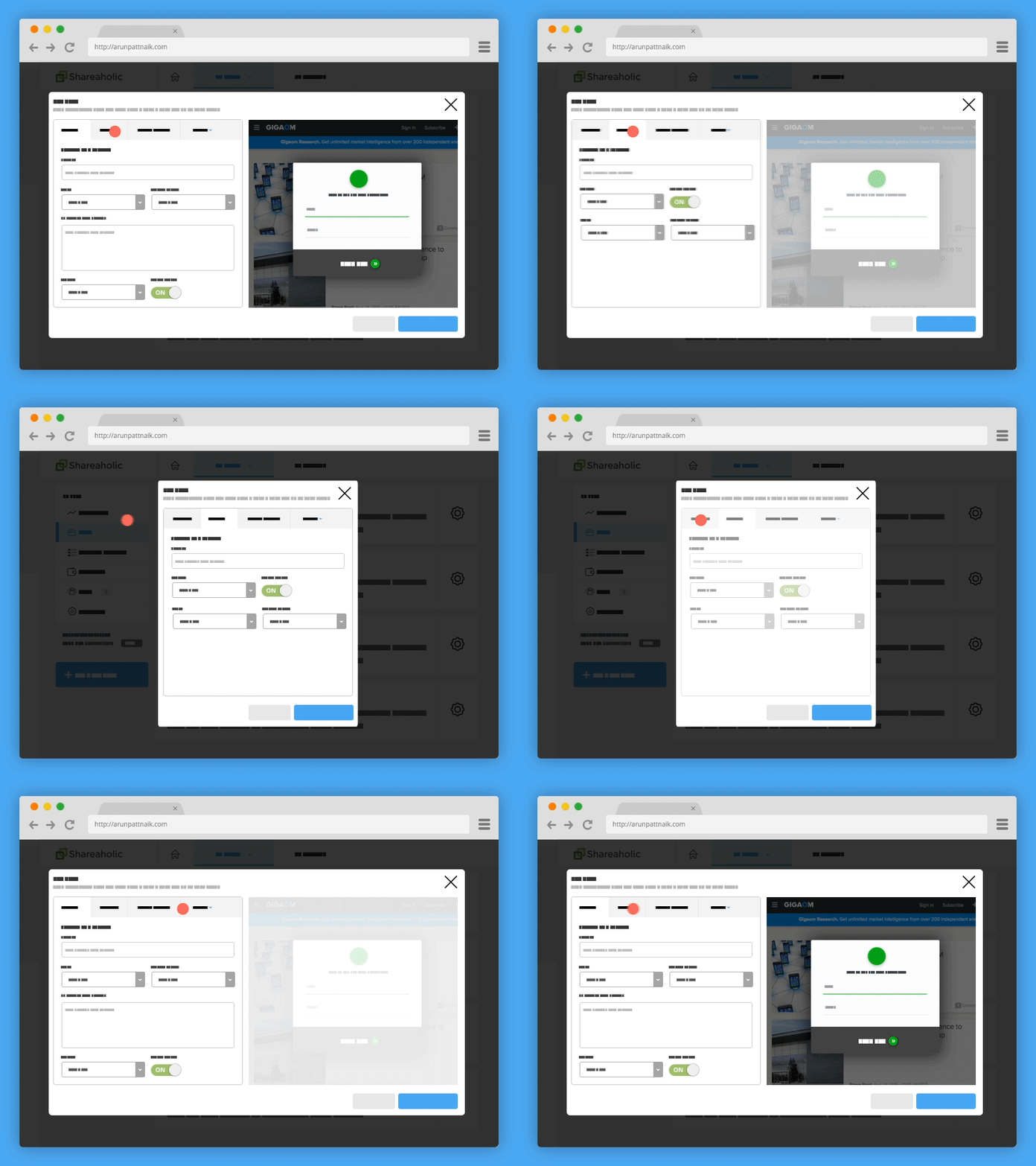
A simple animation I did to explain tab resize behaviour.
It’s important for designers to understand the importance (and power) of good transition states. They not only help the user stay informed, doing it right also keeps them engaged & hence interested in continuing to use the product. The transition states are so powerful that some apps force the transition states between events even if it makes the service appear slower (more on this here & here).
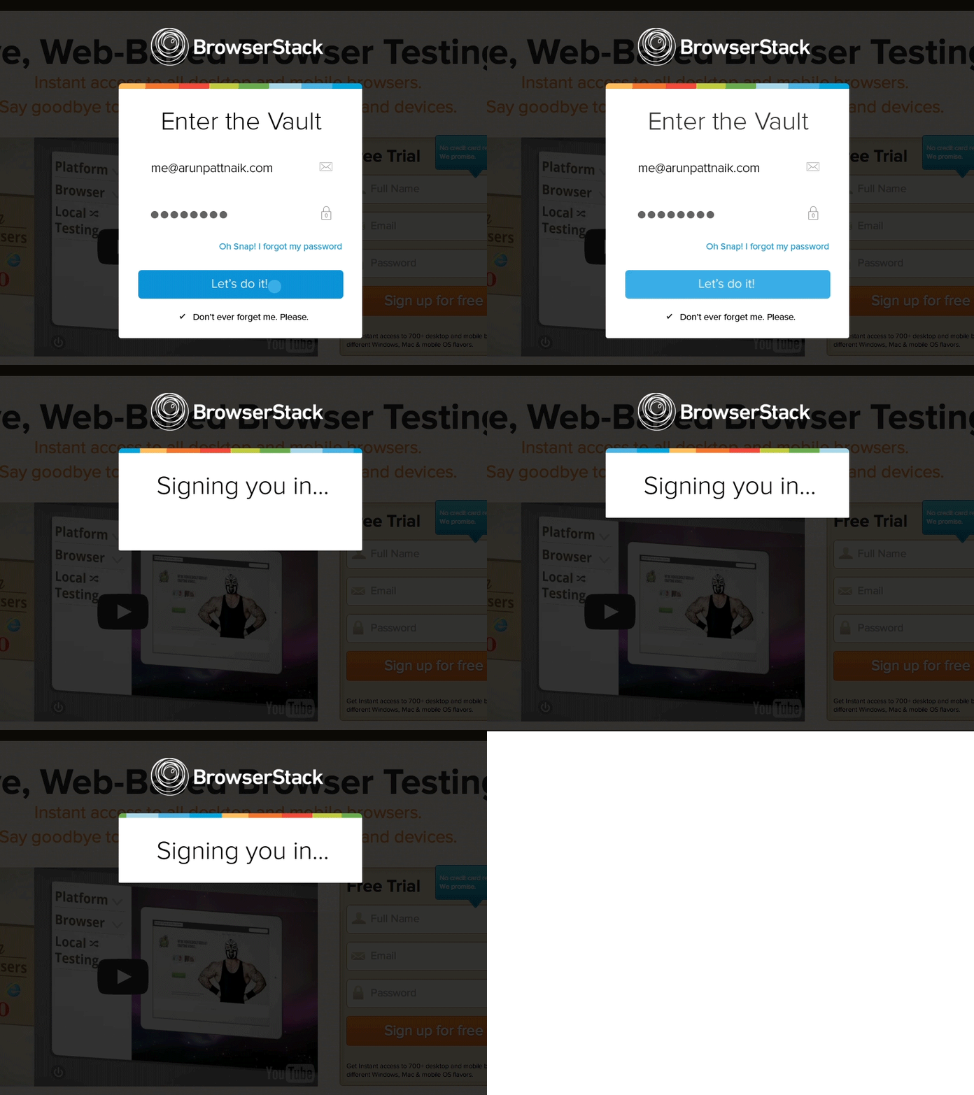
Prototype showing login transition.
The best way to communicate the transition states & interactions to the developers is to show them exactly how we want it done. With the emergence of dozens of powerful prototyping tools in the last few years, its’ a no brainer. I personally use Principle or After Effects depending on what I am prototyping for. You could also use Pixate, Flinto, Framer or any of the available tools.
I chose Principle primarily because it’s basic UI mimics Sketch almost one-on-one, and direct import from Sketch is a cherry on top. Since I use Sketch for almost all my design work, a familiar interface makes prototyping much easier. Before I used Principle, I used to create transition prototypes on After Effects.
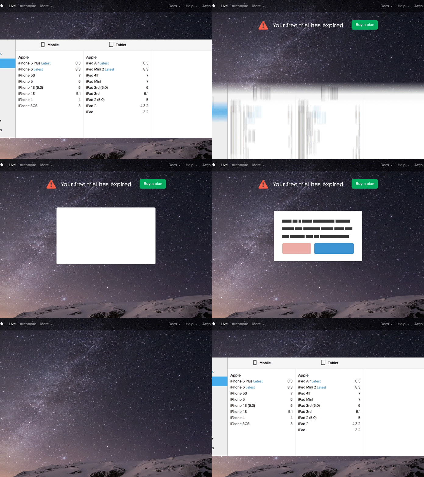
A prototype works best in showing complex UI changes.
If you have to spend an extra hour prototyping a transition, its still worth it. For every hour you spend prototyping, you’re saving several hours of development time. And it eventually helps everyone in the loop. This is more important if you are a designer who doesn’t code or a designer who works remotely. Even if you’re part of a team which works directly with developers, they would have a better grip on your vision if you prototype.
If you work in an agency, sending the client a prototype could save you from getting into code changes later in the development stage. Prototyping is also useful in the creative process because it helps identify transitional problems early in the cycle. If you are a manager worrying about the designer’s “lost” time in prototyping, think about the big picture – at the cost of spending an extra hour prototyping, you’d actually be speeding up the overall production process. Let designers prototype & everyone wins!
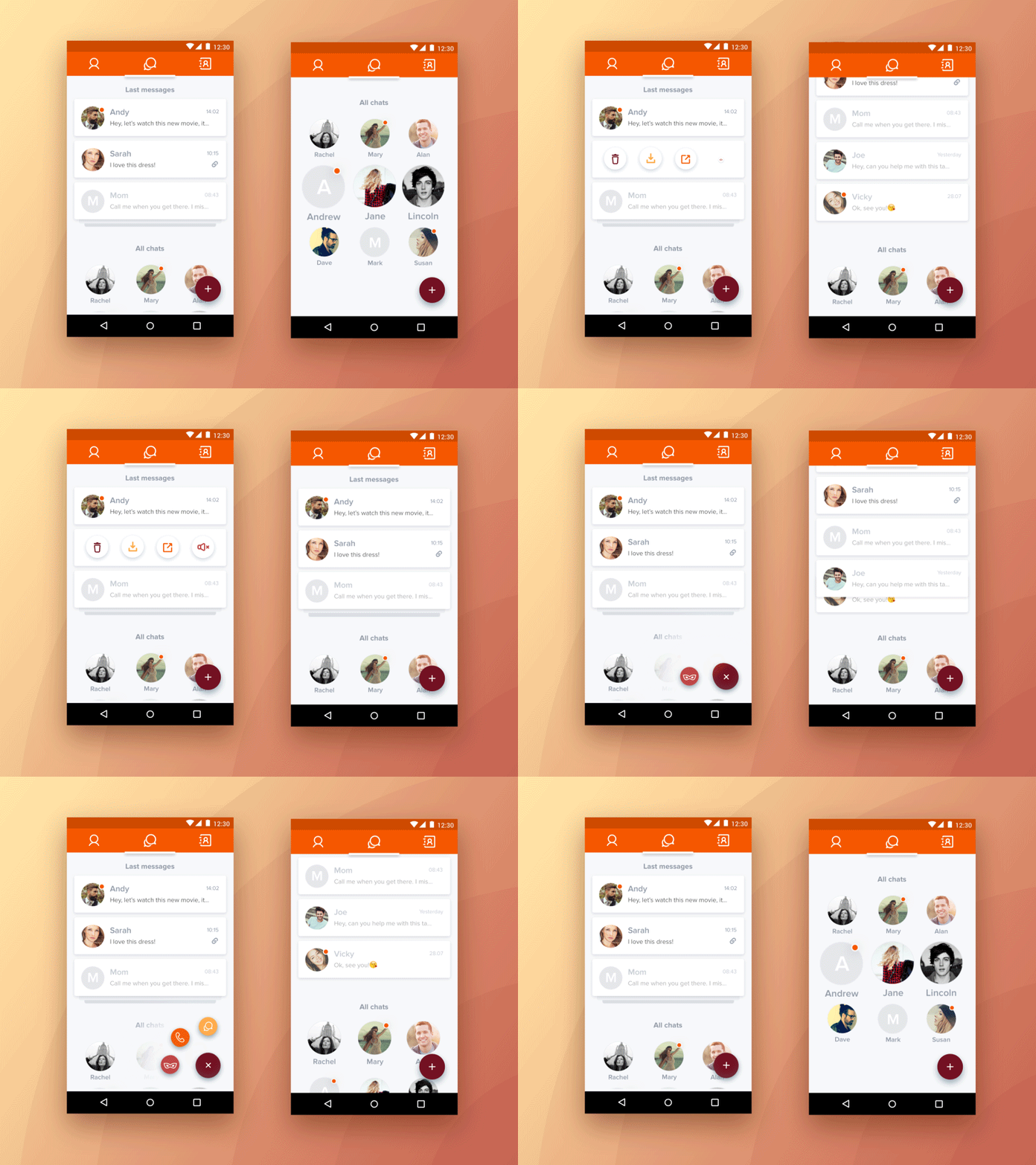
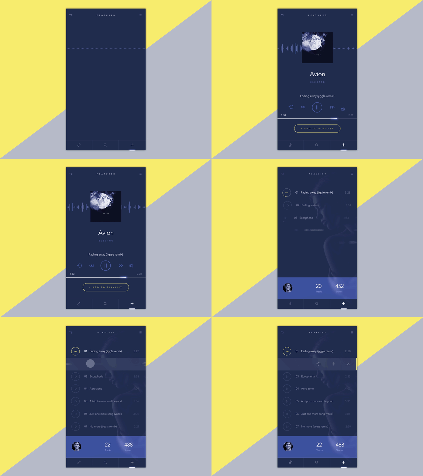
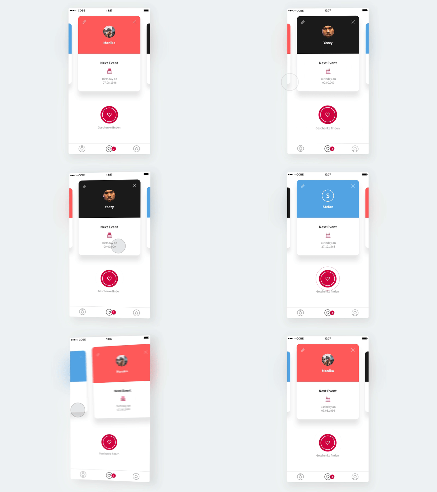
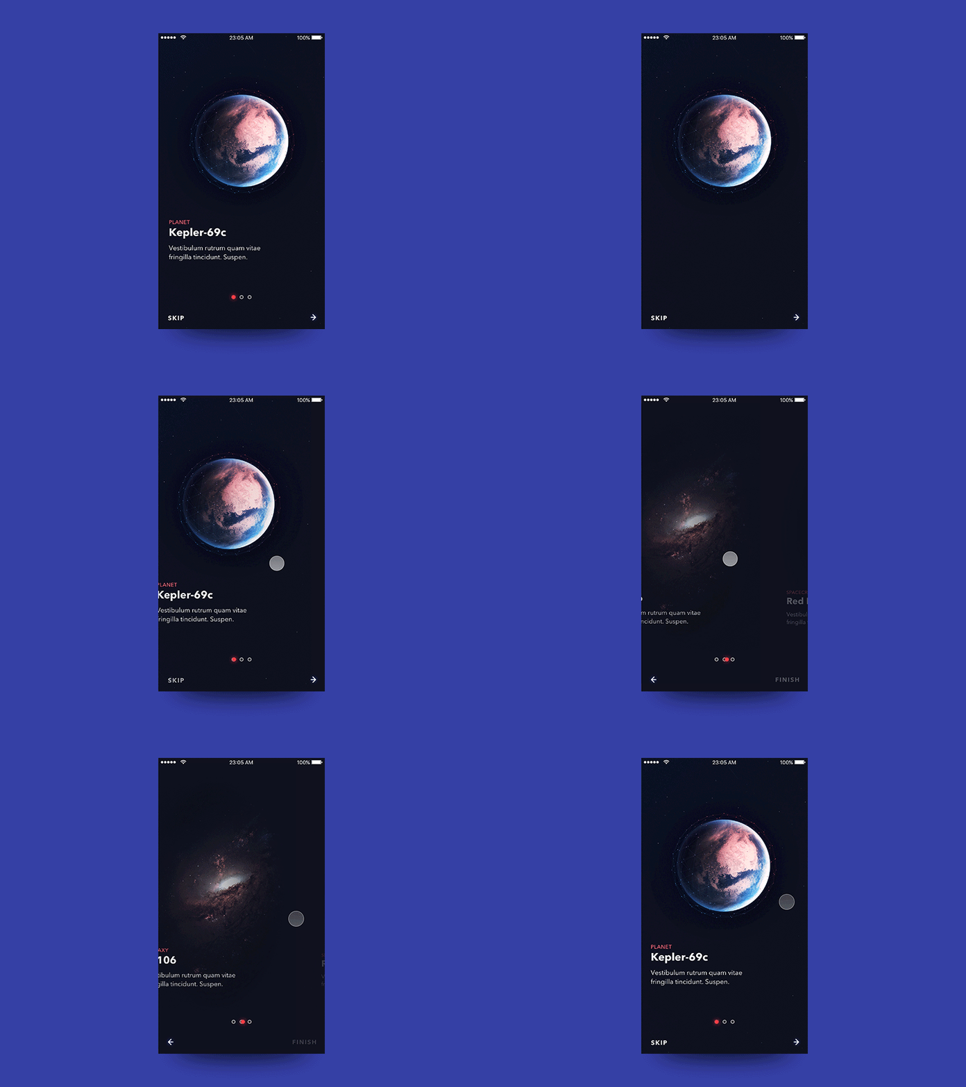
Here are some really well made prototypes on Dribbble.
Head over to Dribbble if you want to see more interesting prototypes. If you’re on Dribbble, you might want to check out my work. Also, I run a product design newsletter called Design for Humans, which is read by to over 15,000 designers & startup enthusiasts around the world. You might want to get in on that.
