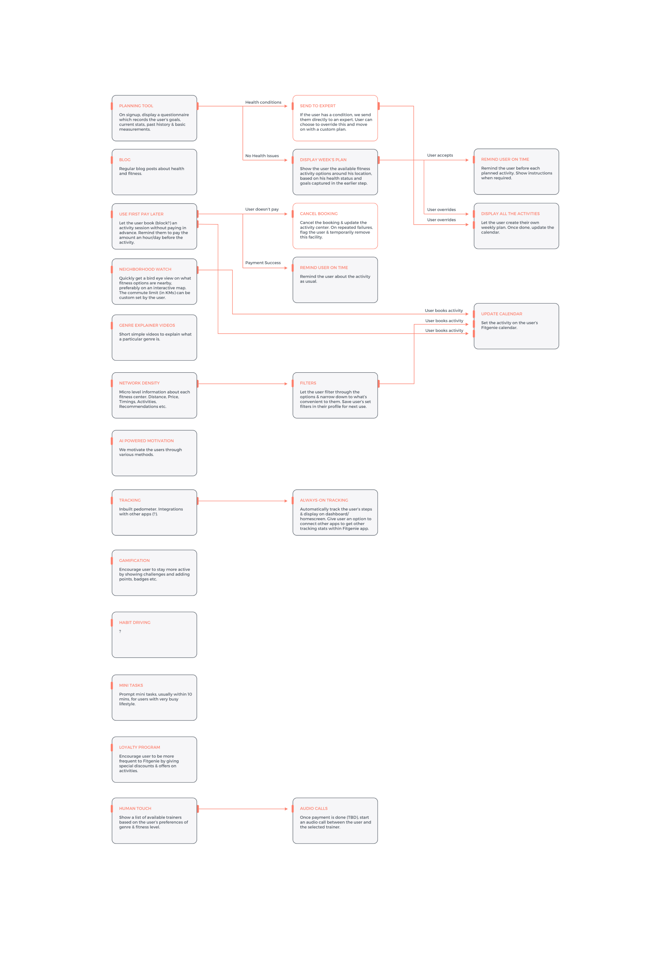
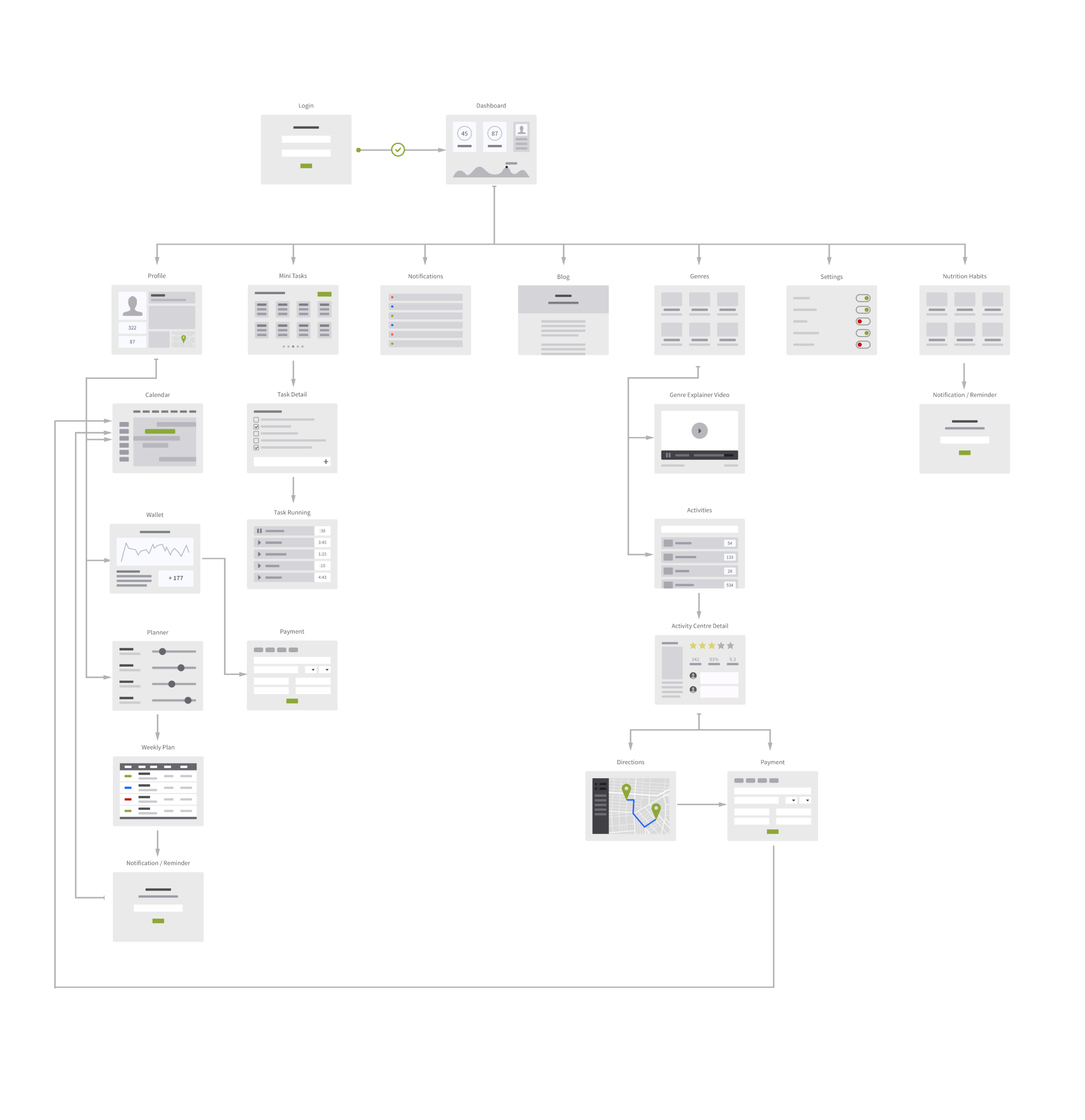
Fitgenie is a smart blend of healthcare, fitness & flexible diet for the people who do not have the time.

I started with the usual preliminary study of how the tax filing industry operates. The biggest insight I found early on is that the motivation for paying taxes in the US is tax returns which is practically non-existent in India. In fact despite being home to a massive 1+ Billion people, only 1% of the Indian population pays taxes. In the United States, and in other countries where H&R Block has been massively popular, taxpayers pay taxes to get tax returns. And H&R Block specializes in maximizing the returns. And since the situation is completely different in India, we had to look into other options.
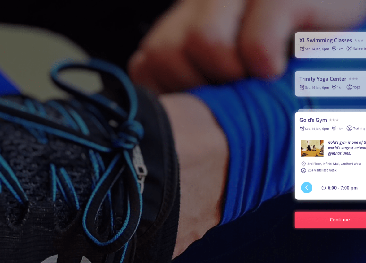
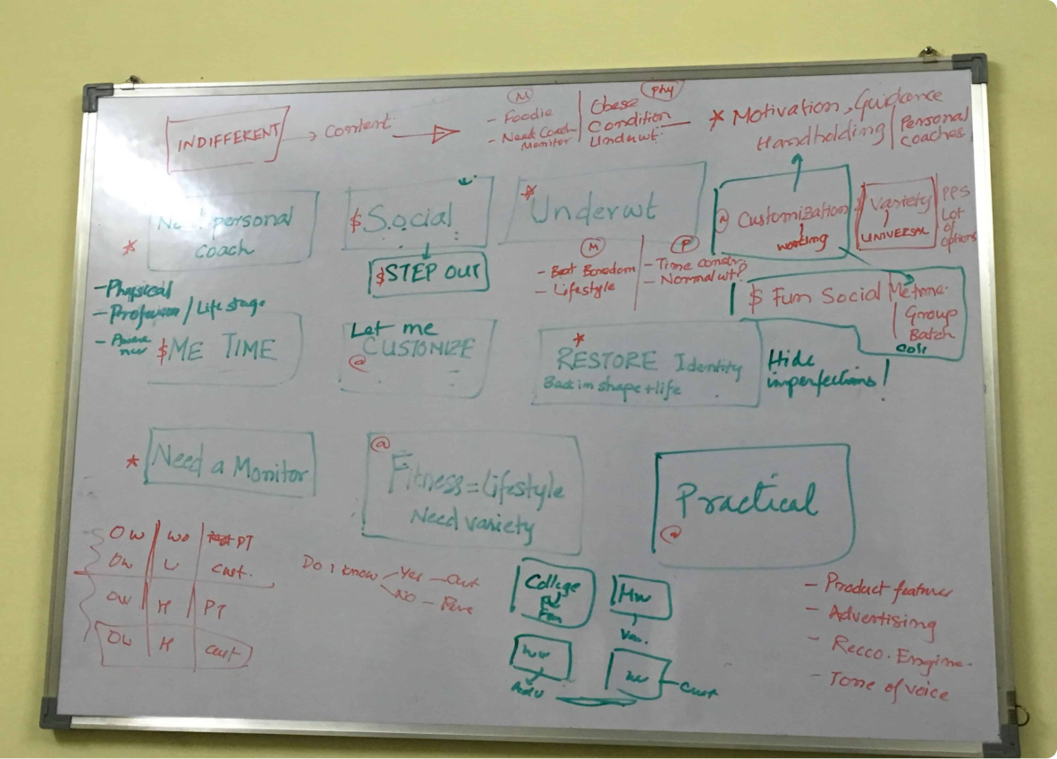
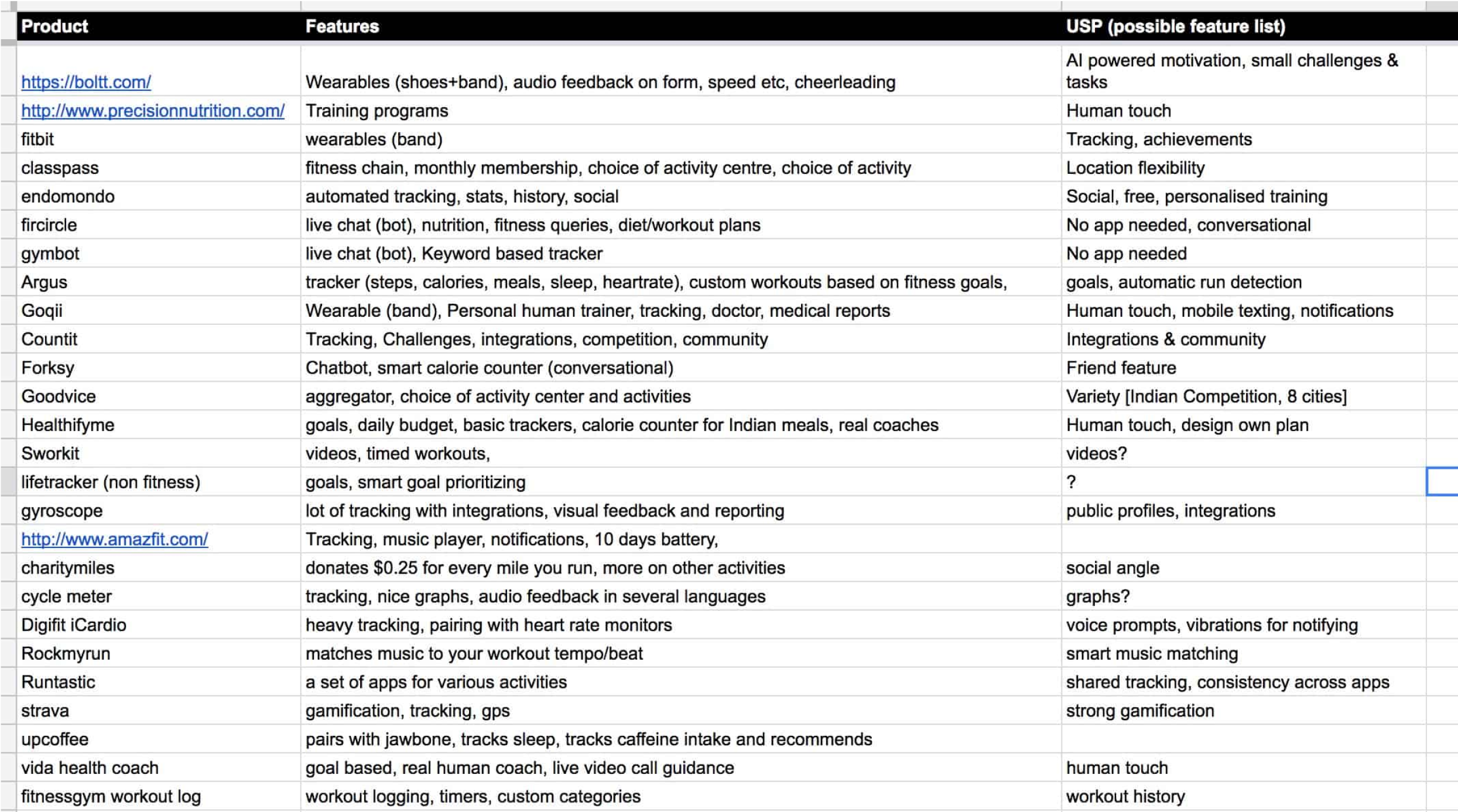
One of the first UX challenges in this project was to correctly understand and validate the target user. We did a lot of brainstorming and decided to go out and meet the users who we thought would be a good fit to the product. Since fitness is a personal subject, the user interviews had to be done in person.
I went to numerous fitness centres where we had contacts in, and spoke to them at length. Since we didn’t have a prototype of the product, we walked them through the overall idea and tried to get their feedback on it. In the first few meetings, we quickly understood that our initial target user was a mismatch and there was something more we can do.

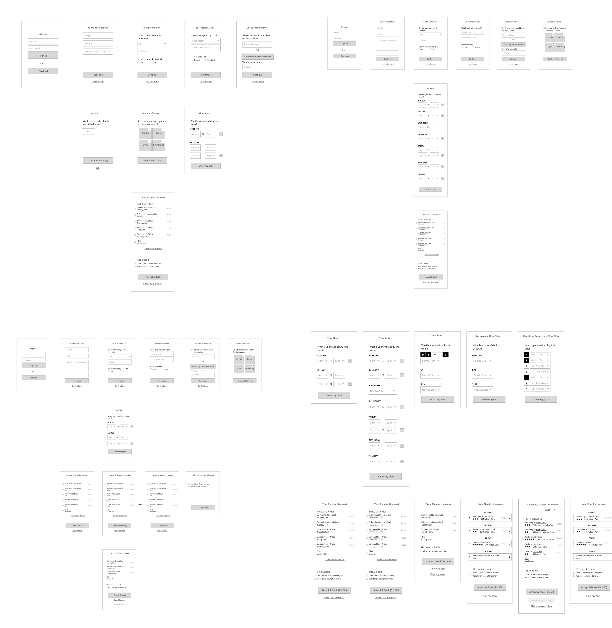
Unfortunately the client had made some commitments to a launch date, so we had very little time left for the visual design. Since the time was short, we decided to go with a clean, minimal look for the first phase. During our user research phase, we also found that our majority of users would be Android phone users. So we went ahead with Google's material design colors We tried dozens of color combinations to see which ones appeal to the target users the most. The idea was to give the app a fresh and vibrant look, while keeping it subtle enough to be used every day.

600%
80%
NDA
MobiKwik is India's leading digital banking platform.
Case study coming soon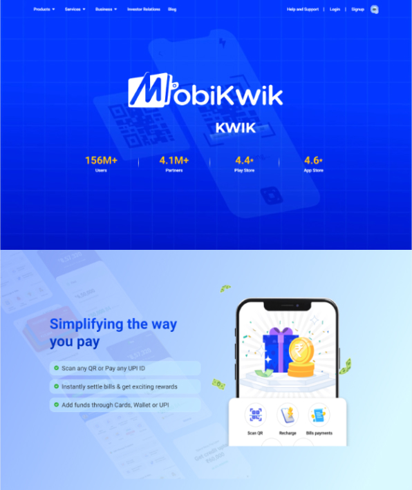
OYO is a global platform that empowers entrepreneurs and small businesses with hotels and homes.
Case study coming soon