One of the most ambitious proptech products in India at the time when real estate was booming.

I started with the usual preliminary study of how the tax filing industry operates. The biggest insight I found early on is that the motivation for paying taxes in the US is tax returns which is practically non-existent in India. In fact despite being home to a massive 1+ Billion people, only 1% of the Indian population pays taxes. In the United States, and in other countries where H&R Block has been massively popular, taxpayers pay taxes to get tax returns. And H&R Block specializes in maximizing the returns. And since the situation is completely different in India, we had to look into other options.
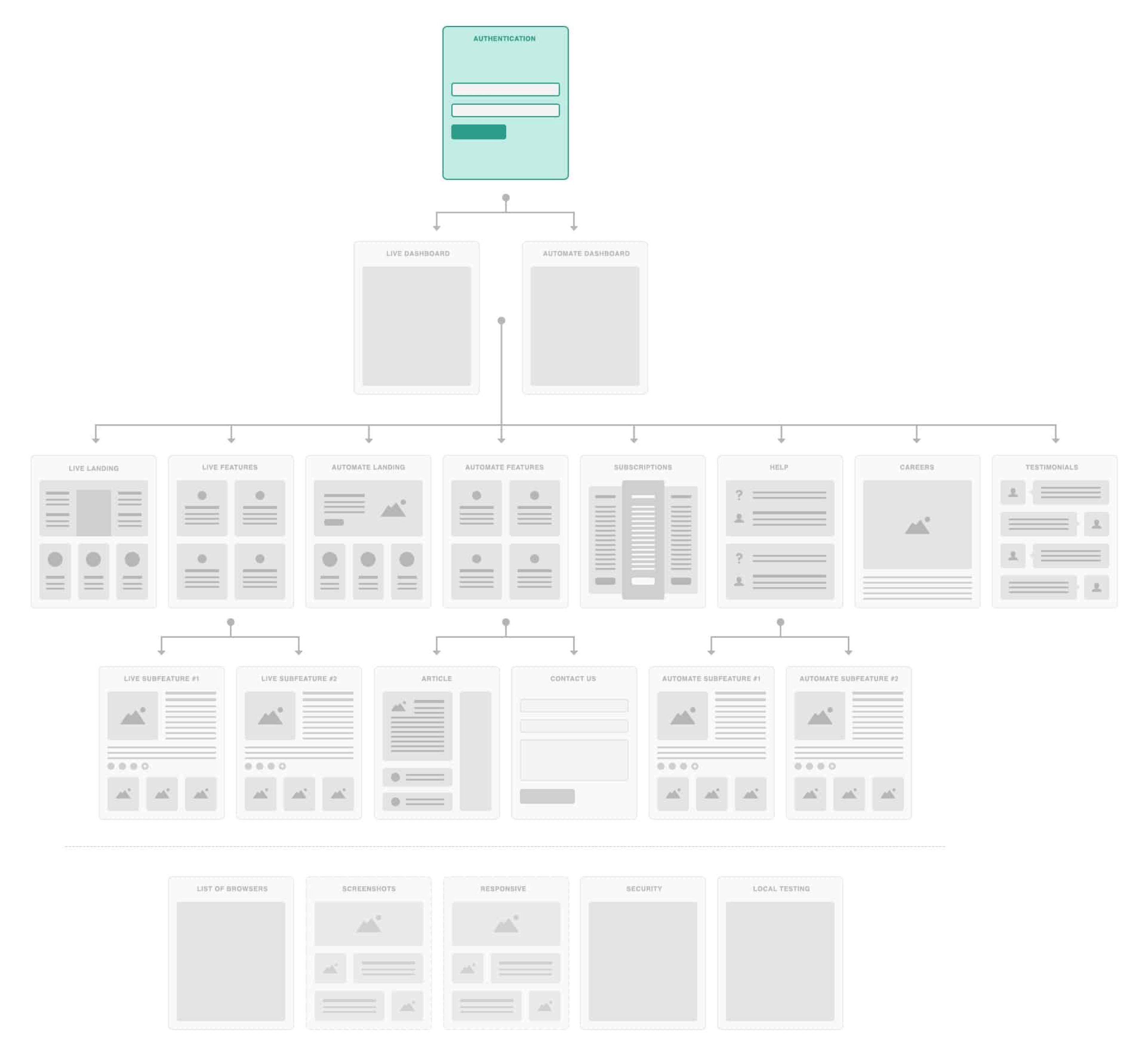
Browserstack has been focusing primarily on desktop browsers until that point. But now that mobile internet traffic surpassed desktop traffic in 2014 and it actually started contributing close to 60% of all web traffic, Browserstack had to focus on mobile infrastructure. I worked on restructuring the product hierarchy which brought the flagship product ‘Live’ to the front & centre. This is the redesigned information hierarchy.
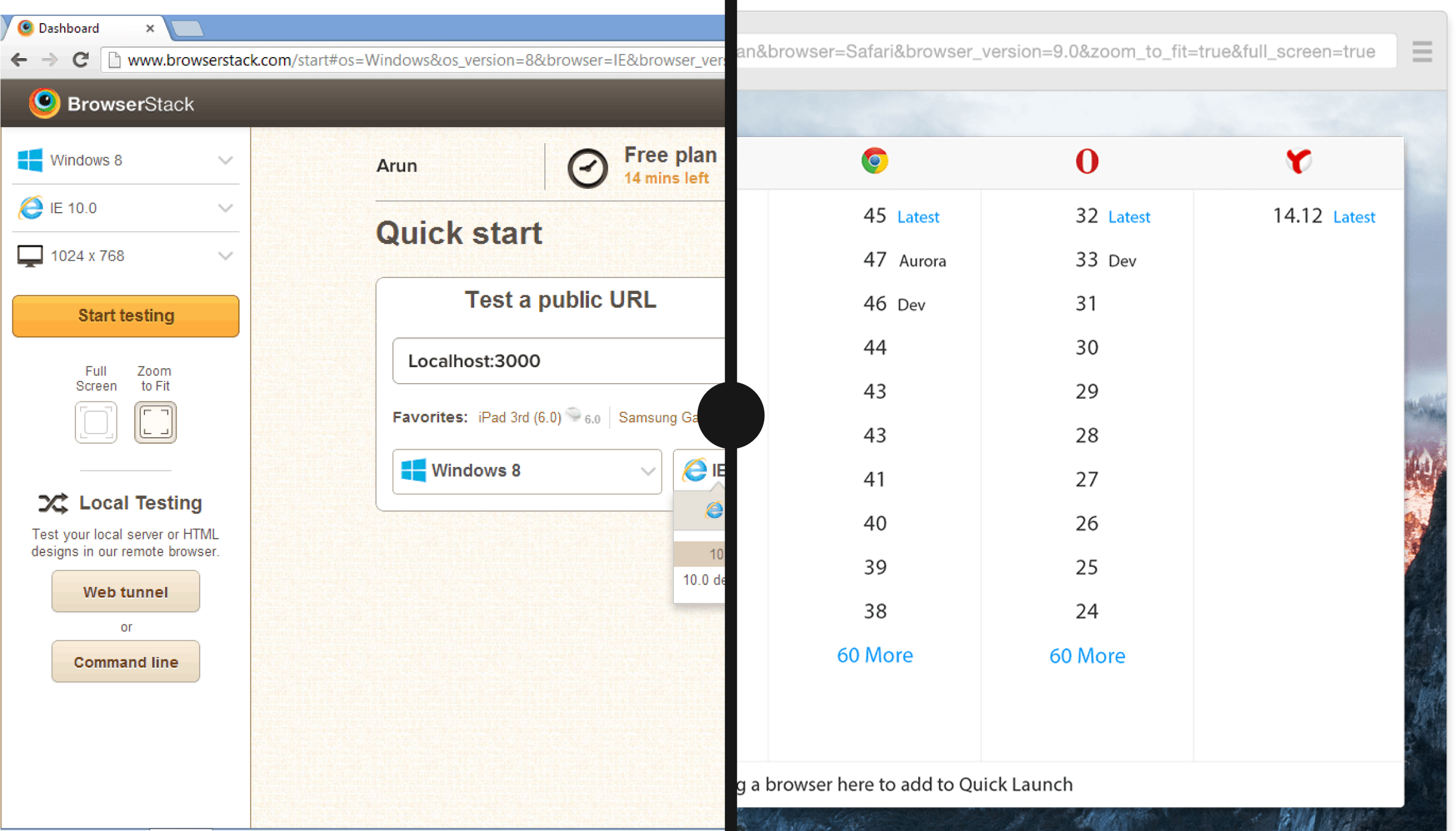
The Browser List is the heart of BrowserStack Live. Hundreds of browsers & devices distributed across over a dozen operating systems & platforms and each containing tens of individual versions. Creating a scalable solution to this without overwhelming the user was a mammoth task.
The idea was to show a user all the options, while keeping them aware of what they’re looking at and make an informed choice. Not just because we wanted to minimise false clicks, but also because every click immediately boots up a real device which makes cancelling the launch sequence a difficult & expensive process.
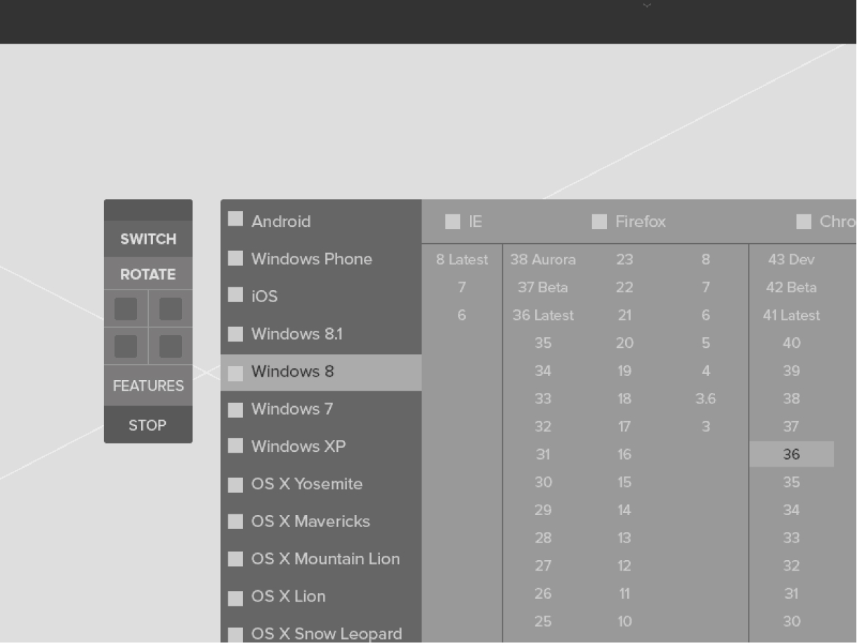
The design worked perfectly when they had limited number of
devices & browsers. But as they went on increasing the number of devices, they quickly fell into scalability problems. I knew that it was no longer a UI problem. The problem has to be seen from a different angle. So I took a step back and started looking into how this design came into the picture. For several weeks, I made a lot of concepts of how things might work.
The next challenge was to convert the complex workflow into functional wireframes. This is when we convert the abundant data into meaningful information which a user can consume. Finding information should be effortless and hassle-free. We needed to keep the number of screens to a minimum, which meant designs dozens of wireframe variations with different features/functions clubbed together and test which ones work better than others.
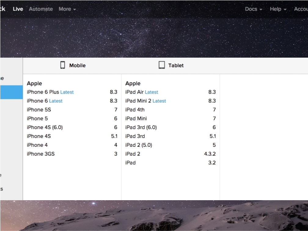
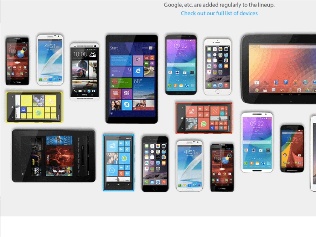
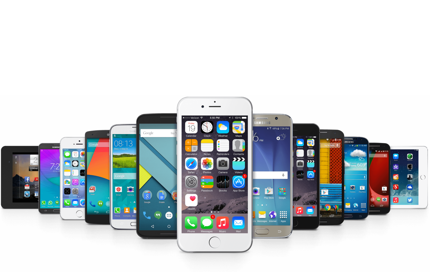
*in 2015
With the new IA and the redesigned UX for Browser Listing in place, we were ready with the Live product. The next step was to test it with real users. we quickly started testing the concepts with very controlled demographics. For instance, we only launched the redesign in UK and I carefully studied their reactions for about a week, making fixes in the design whenever necessary.
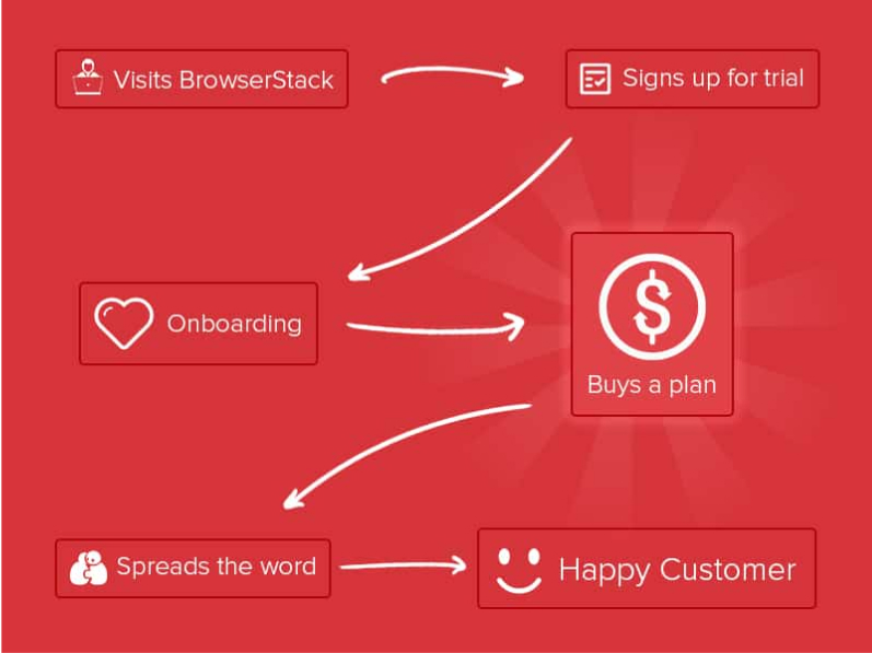
NDA
400%
NDA
MobiKwik is India's leading digital banking platform.
Case study coming soon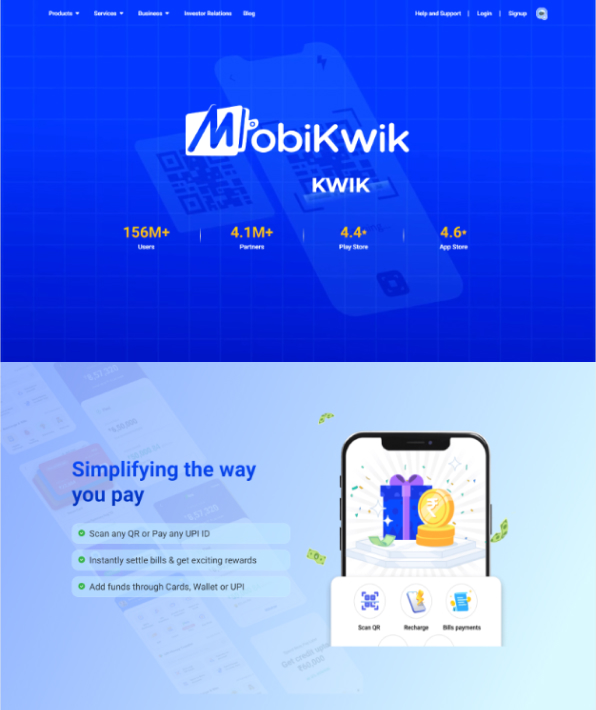
OYO is a global platform that empowers entrepreneurs and small businesses with hotels and homes.
Case study coming soon